

“Reality is not a matter of opinion. Raw opinion is like math errors or typos – understandable human error, but uninformative. To err is human, to understand is hard work.”
– Alan Reynolds, Income and Wealth
In a recent Citigroup report by Chua Hak Bin [1] who suggests that a dual track economy is emerging in Singapore. In that report, Chua and his colleagues made an argument using the Gini coefficient to justify that income inequality has risen as a result, which we quote:
Income inequality has risen as a result. The Gini coefficient – a measure of income inequality – has climbed steadily to 0.52 in 2005 from 0.49 in 2000. This largely reflects the divergent household income trends, where the higher income quartile group saw larger income gains relative to the lower quartile groups.
The Gini coefficient has become a discussion topic among bloggers and journalists on the issue of income inequality in Singapore [2]. The question is: just how conclusive is the Gini coefficient in providing the silver bullet to illustrate income inequality? To make life interesting, we demonstrate with a series of counter arguments that the known variations of the Gini coefficient based on income are not robust enough as economic measures of income inequality. Instead, we advance an argument (mainly attributed to Reynolds [3]) that consumption among the different income groups is more reliable as a measure for inequality. (Updated 29 Jan 2007)
The Gini Coefficient in a nutshell
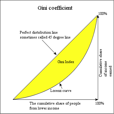
A picture paints a thousand words and the best way to describe the Gini coefficient is to look at the graph above (extracted from Wikipedia). On the horizontal axis, you start with the lowest income (first 20%) all the way to the highest income (80-100%). On the vertical axis, you measure the cumulative share of the total income measured between zero to a hundred percent. Intuitively, if you believe that all income and wealth are distributed equally among everyone in society, the Lorenz curve is characterized as a diagonal 45 degree line on the graph. In reality, we know that income and wealth are never distributed equally in society, so the resultant picture will be a curve drawn below the straight line, shaped like a bow and string. Taking the ratio between the area bounded by the curve and the area bounded by the straight line, we obtained the Gini coefficient.
The easiest way to understand the Gini coefficient is the following. If the gap between the bow and the string is wider, it means that the Gini coefficient is large which translates to a greater degree of inequality as a result. The best way to calculate this ratio is to use the income distribution of the households (raw income before transfer and tax), which is adopted by the Census Bureau. In fact, online calculators are provided to convert such figures into a single Gini coefficient. The Census Bureau in the US will compute out 14 different variations of the Gini coefficients for comparison. However, the most common type used by analysts is based on the conventional measure of money income.
When Gini can be misleading
There are some situations which the Gini coefficient makes a poor metric to look at inequality. To simplify the discussion, I will discuss some possibilities how it can fail considerably and propose a solution based on qualitative economics in the next section.
Since the Gini coefficient is a mathematical construct, one should note with caution how the metric is computed out from the data. Alan Blinder [4] demonstrated a simple counter example that there exist cases where you can get two different Lorenz curves with different shapes, but they yield the same Gini coefficient. Imagine the following situation when you have 3.6% for the lowest quintile (the really poor) in the construction of curve A and 0.6% similarly for the same lowest quintile for curve B (see appendix 1). However, if you start tweaking the numbers in the other quintiles, you will end up with the same Gini coefficient.
It is known that the Gini index (even different variations of the metric constructed from income) is sensitive to the changes in the middle of the earnings distribution rather than the tails. Hence it is difficult for us to gauge from the Gini index, who is the real poor and who is the real rich. The mistake most people make is that once the Gini index demonstrates that there is inequality, their immediate inference is that the poor is getting poorer. From Blinder’s example, you can already see that it may be the percentage of the real poor is decreasing, but the Gini coefficient is still advocating inequality. This is the kind of inference made by some politicians, journalists and activists in the application of the Gini index to make a non sequitur judgement for inequality and income. Seriously, even if the percentage of the really poor is decreased, the Gini index can still reflect a larger inequality gap.
So, if the metric is ambiguous in its interpretation from a mathematical viewpoint, the onus is on how the economic data is selected. Most of the time, these coefficients are computed in pre-transfer payments (for example, the progress package instituted by the Singapore government) and pre-tax (before your income tax sets in). It is known that the Gini index (without taking tax and transfer money payments) is increasing in the US. Once if the coefficient is adjusted for taxes and transfers, a different picture emerges. In fact, the household Gini coefficient was reduced to 0.4 in 2004 [5]. So, the two questions which eludes many readers (including myself) from Chua’s analysis on the Citigroup report, “How is the Gini coefficient computed? Does it takes into account with the pre-transfer and pre-tax data?” In fact, the Gini coefficient was computed using the per capital household income from work by the Department of Statistics, Ministry of Trade and Industry [6] and the Citigroup report made their interpretation based on that report. Without further information, one can fathom a guess that they did not take taxation and transfer money payments into account.
Scheherazade’s Gini: Income or Consumption?
Given the ambiguity of the Gini coefficent, we note that the trend towards rising inequality are dependent on several factors:
- How do we choose to measure real income and the period of time which that takes place?
- Are we using the mean or the median average for the income capita per household?
- Do we take into account of any major event that might create possible distortions to the computation, for example, if Singapore has gone through a major tax reform or recalibrate the way how they calculate their metrics?
The central thesis is that the Gini coefficient is measured primarily on income. However, it is just a snapshot and does not reflect anything about the standards of living in society. Before I go to my next point, consider the following situations:
- A poor homeless and jobless man in the UK is getting 200 pounds (=S$600) a day through begging and social net, but spends all his money on acquiring drugs. He gets his food and accommodation from the social workers and the church.
- A family with middle class income is splurging their money beyond their means on buying luxurious goods, for example, a sports car.
- A young urban professional earning about S$6-10K, paying his car and condominum.
- A Singaporean PhD student studying in the US with his spouse and kid and earning less than $1.5K a month
Some of these cases reflect what income cannot measure. Inherently the PhD student’s earning capability changes when he graduates with his doctorate. The poor homeless man is not spending any money on food and accommodation, but on something else. You will realize that income is a static measure and may not adequately reflect reality. However, consumption on the other hand, provides a better measure on the inequality issue. By studying exactly how the poorest 10% of the population is spending their money, you know why and how they cannot cope. For example, in poor families, they tend to have more kids and education constitutes a major cost in their monthly budget. If 50% of the poor population in the UK is spending their money in buying drugs, the problem with the policy makers is not to pay them more via the social net, but to tackle the drug problem instead.
Living standards are better measured by consumption rather than by income. Consumption constitutes the quantity and quality of each household’s food, clothing, housing, transportation and entertainment. In fact, one year’s income is not definitive enough to describe anything about living standards. The real measure should comprise of both the past and future income. Think about the mortgages and loans, which allows consumption to happen from expected future income. Two more arguments actually justify this choice of construction:
- A household’s income can appear to be lower if somebody in the family is experiencing transition periods, for example, a job loss or illness, and to be higher if someone in the family experience a windfall through 4D and Toto. The consumption averages out over the years by selling assets or borrowing in difficult times and saving in good times.
- The life-cycle pattern to income from work and savings is another indication why consumption is a better choice. Young people start out with wages and salaries far lesser than what they earned as they approach middle age. In Singapore, a lot of people have no time to accumulate significant savings and have to borrow against their future earnings to afford a house, a car or other expenditure. Once they hit middle age, they will have accumulated some assets, and reinforce their assets by making investments. Finally, when they retire, their savings are drawn upon to finance consumption. Hence, over the entire life cycle, consumption is averaged out.
By constructing a Gini coefficient based on consumer spending and income, you get a better reflection of how inequality in society looks (see the footnote in [7]).
How does that look in Singapore?
In Singapore, when someone claims that the income gap is widening, it does not really mean that there are more rich and more poor people. It can also mean that the middle class is being squeezed because their expenditure is growing while their income is stagnating. Using the Gini to infer such arguments can lead to wrong conclusions about what the actual picture is. Getting a hold on our spending habits will provide a clearer picture on how this inequality really looks.
Acknowledgments: The author thanks Huichieh & Speranza Nuova for helpful comments to this article. The author also thanks Andy Ho in providing the report [1].
References and Endnotes:
[1] Chua Hak Bin, Lim Jit Soon and Huang Yiping, “Singapore: A Dual Economy”, Citigroup Report, 25 Jul 2006.
[2] Speranza Nuova, Inequality and Magic Gini (also published in Singapore Angle: Perspectives); Yaw Shin Leong, Of Wealth and Income Equality; Yawning Bread, Sir, may I have the can please?; Texo.sg, Flapping over Gini; Seksi Matashutyrmouf, GINI; Kway Teow Man, A Whole Load of Gibberish; Andy Ho, “Rich will get richer, as will the poor”, The Straits Times, Sep 12, 2006.
[3] Alan Reynolds, Income and Wealth, Greenwood Guides to Business and Economics.
[4] Alan Blinder, Commentary, in Tax Matters and Inequality, page 40.
[5] US Census Bureau, “The effects of Government Taxes and Transfers on Poverty”.
[6] Department of Statistics, Ministry of Trade and Industry, Republic of Singapore, General Household Survey 2005, Statistical Release 2: Transport, Overseas Travel, Households and Housing Characteristics, chapter 3: Household and Housing Characteristics.
[7] In Chapter 8 of [3], Reynolds wrote a review on Gini index constructed from US consumption data. It demonstrated that the inequality only happened between the period of 1981 and 1986, and appears to be a cyclical phenomenon. From 1986 to 2001, consumption inequality declined and wage inequality was unchanged.
Appendix 1: Comparison of Income Distributions Producing the Same Gini Index (Source: Alan Blinder in Reynolds “Income and Wealth”).
| Income Share of | Distribution A | DIstribution B |
|---|---|---|
| Lowest Quintile | 3.6 | 0.6 |
| Second Quintile | 8.9 | 11.9 |
| Middle Quintile | 15.0 | 15.0 |
| Fourth Quintile | 23.2 | 26.2 |
| Top Quintile | 49.4 | 46.4 |
| Approximate Gini | 0.423 | 0.423 |